axio energy specialises in delivering engineered, renewable energy installations in complex remote locations.

Low impact connection.
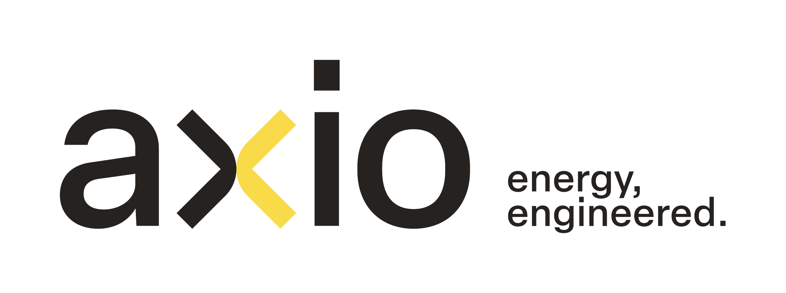
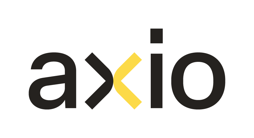
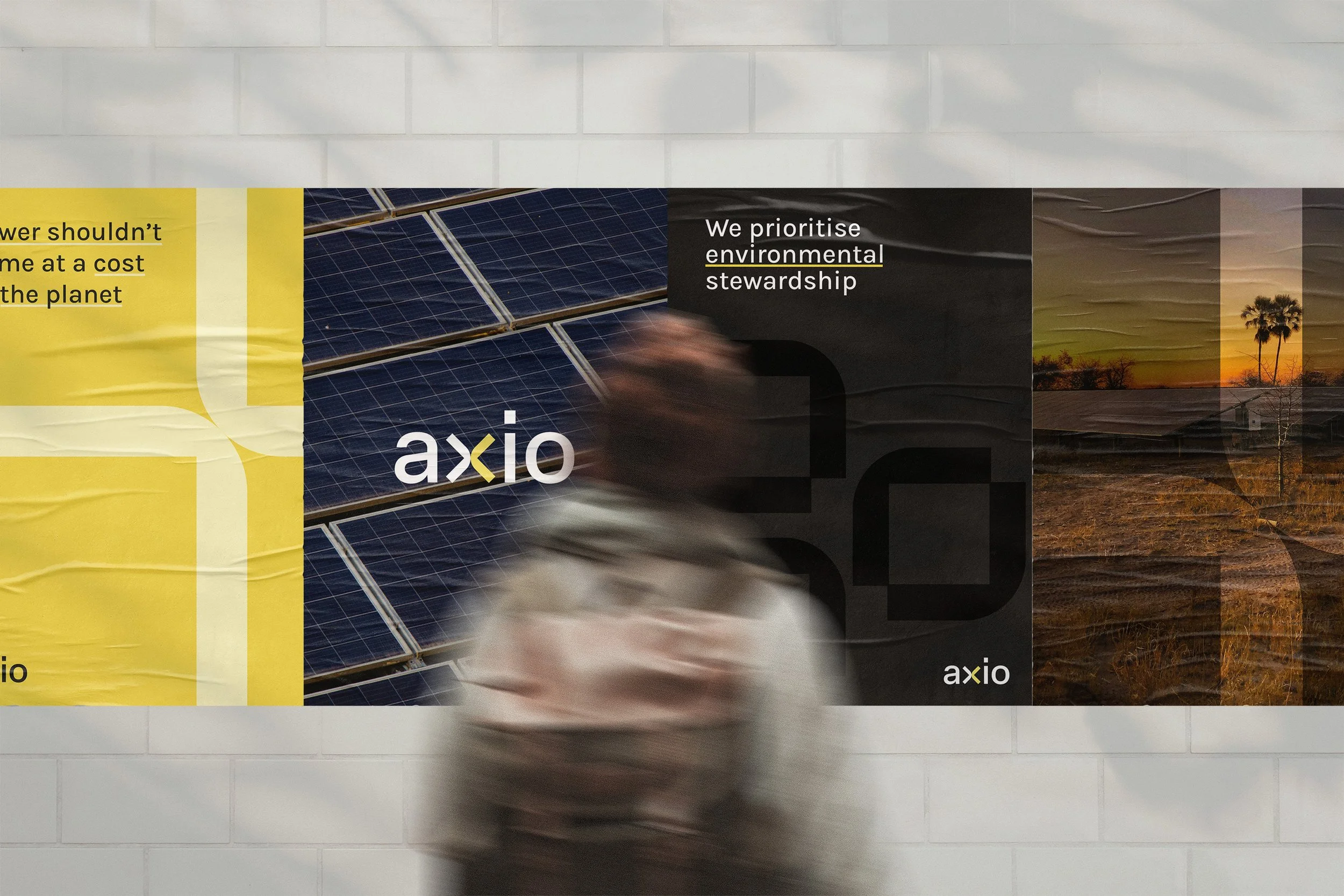
We designed the Axio wordmark to reflect simplicity, elegance, and modernity. At its center, the ‘x’ has been reimagined with two mirrored curves, forming a distinctive icon.
The black curve symbolizes engineering and expertise; the yellow, the sun. These curves meet at a single point—symbolizing the delicate balance between innovation and nature, with minimal environmental impact.
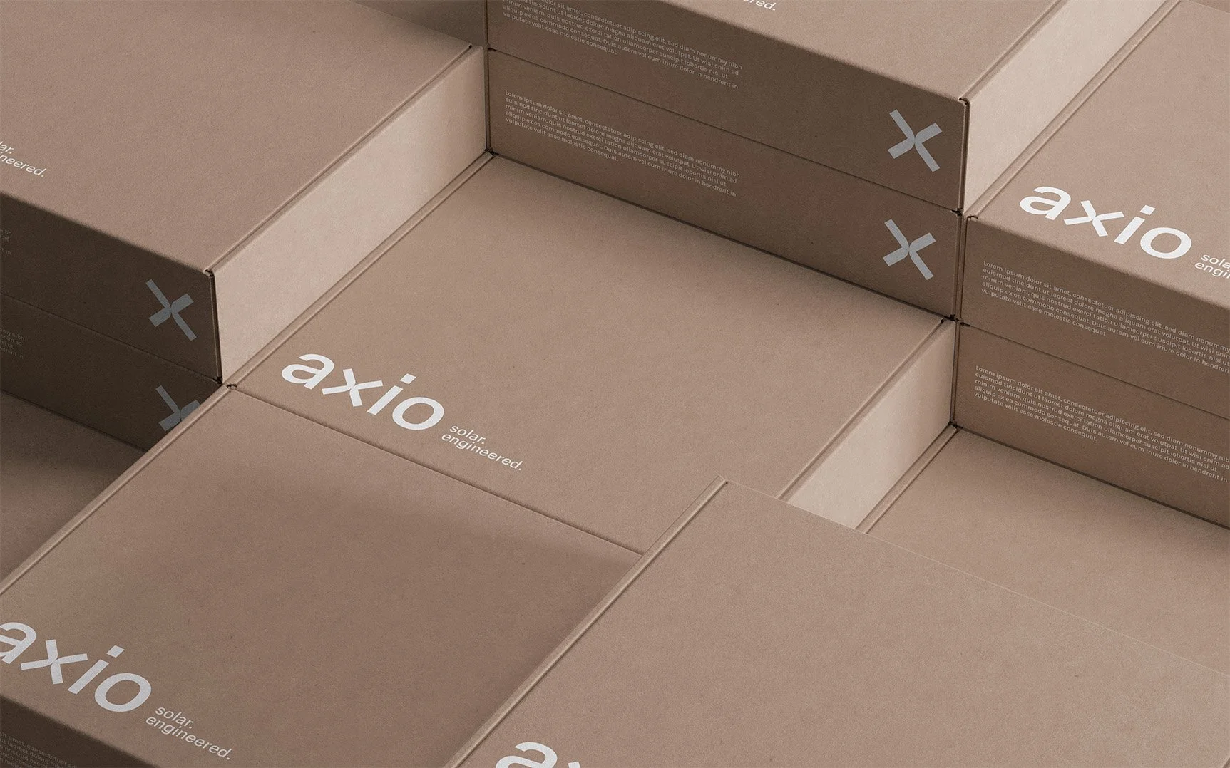
Beyond the wordmark, the reimagined ‘x’ serves as a powerful graphic element. It can be extended across brand applications to reinforce identity, create visual consistency, and echo the brand’s core themes of balance, precision, and clarity.


Colours & Typography.
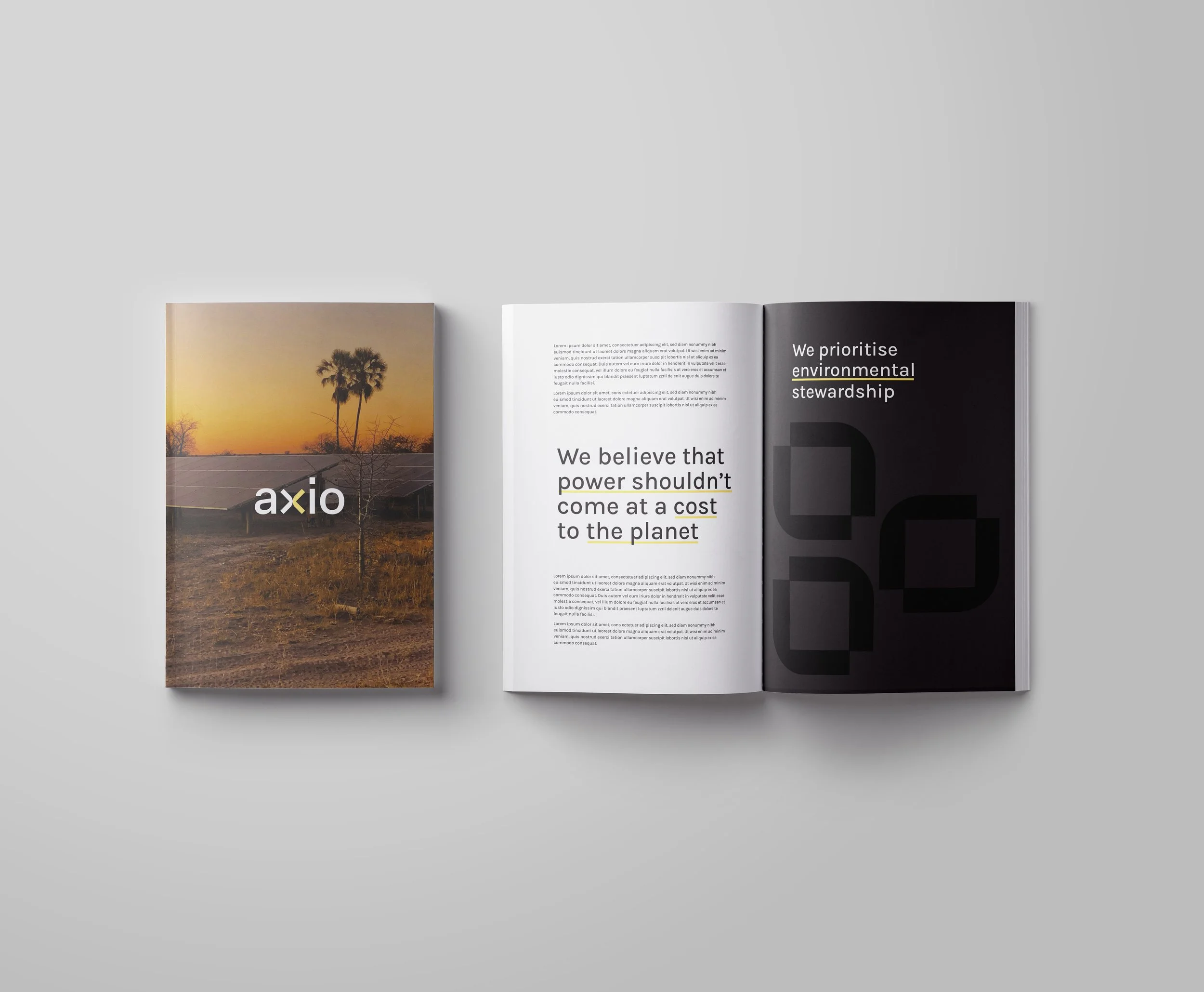
The Axio color palette combines charcoal, yellow, and white to create a clean, modern aesthetic. The contrast between deep charcoal and vibrant yellow strikes a balance between sophistication and energy, while generous white space keeps the overall feel minimal and uncluttered.
This sense of clarity is echoed in the chosen typography, which is modern, clean, and highly legible, reinforcing Axio’s commitment to simplicity, precision, and thoughtful design.

Versatile Logo Suite